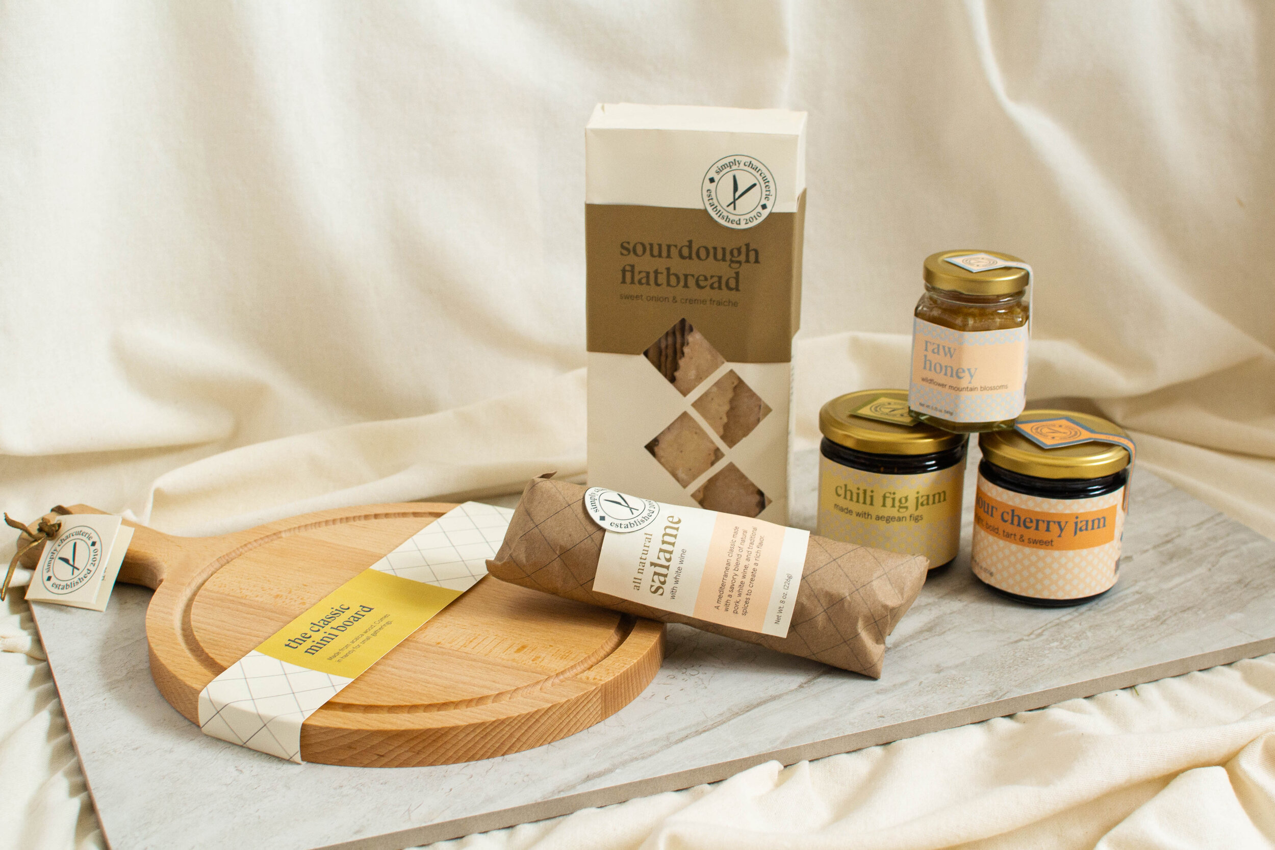
Simply Charcuterie
Category: Branding & Packaging
Completed: Fall 2020
The Goal.
Charcuterie is a culinary experience that allows for many varying branding styles. I quickly found, however, that I did not like the pretentious design style I often saw associated with various charcuterie boards and relevant products. I knew I needed a cohesive, fresh style while creating a large, expandable packaging family. This snacking phenomenon was begging for a contemporary, simple upgrade.
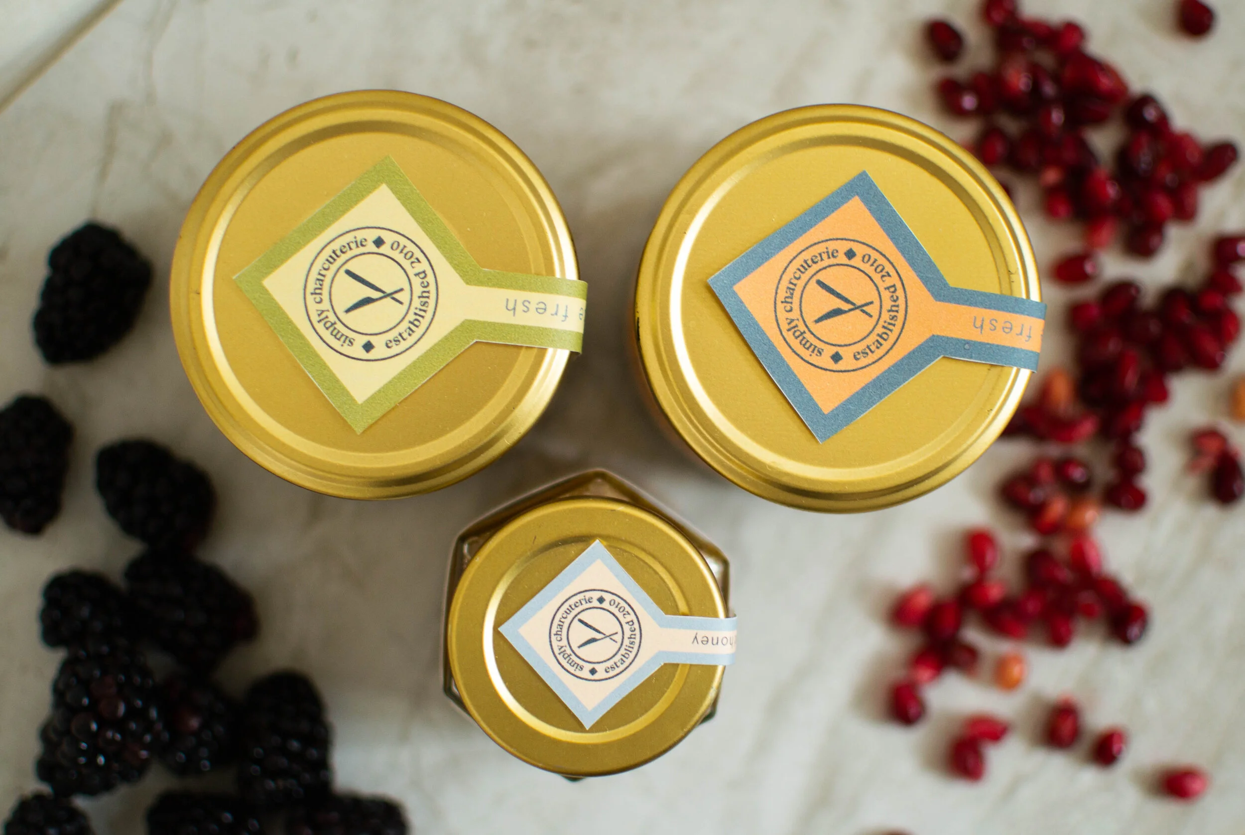
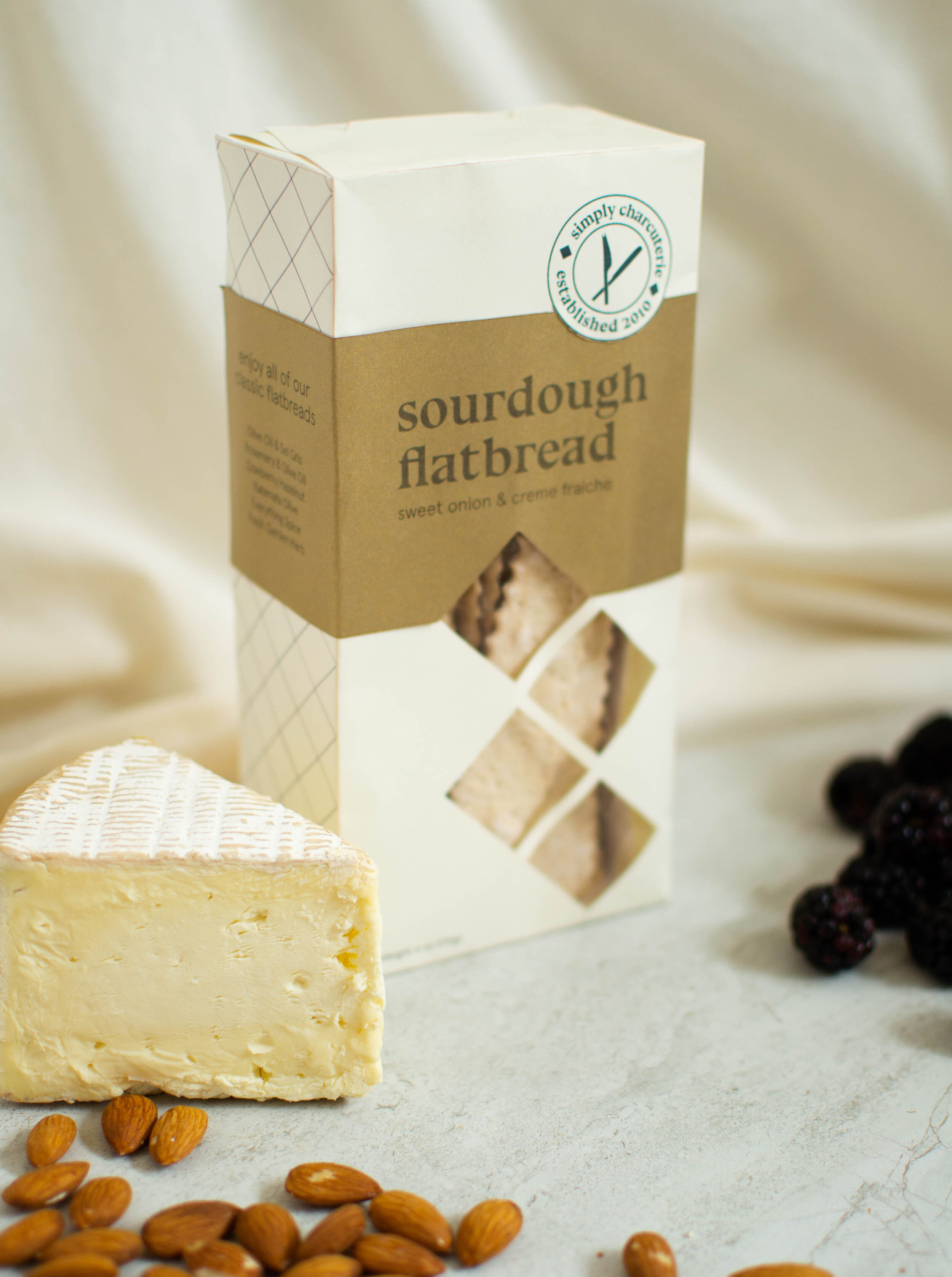
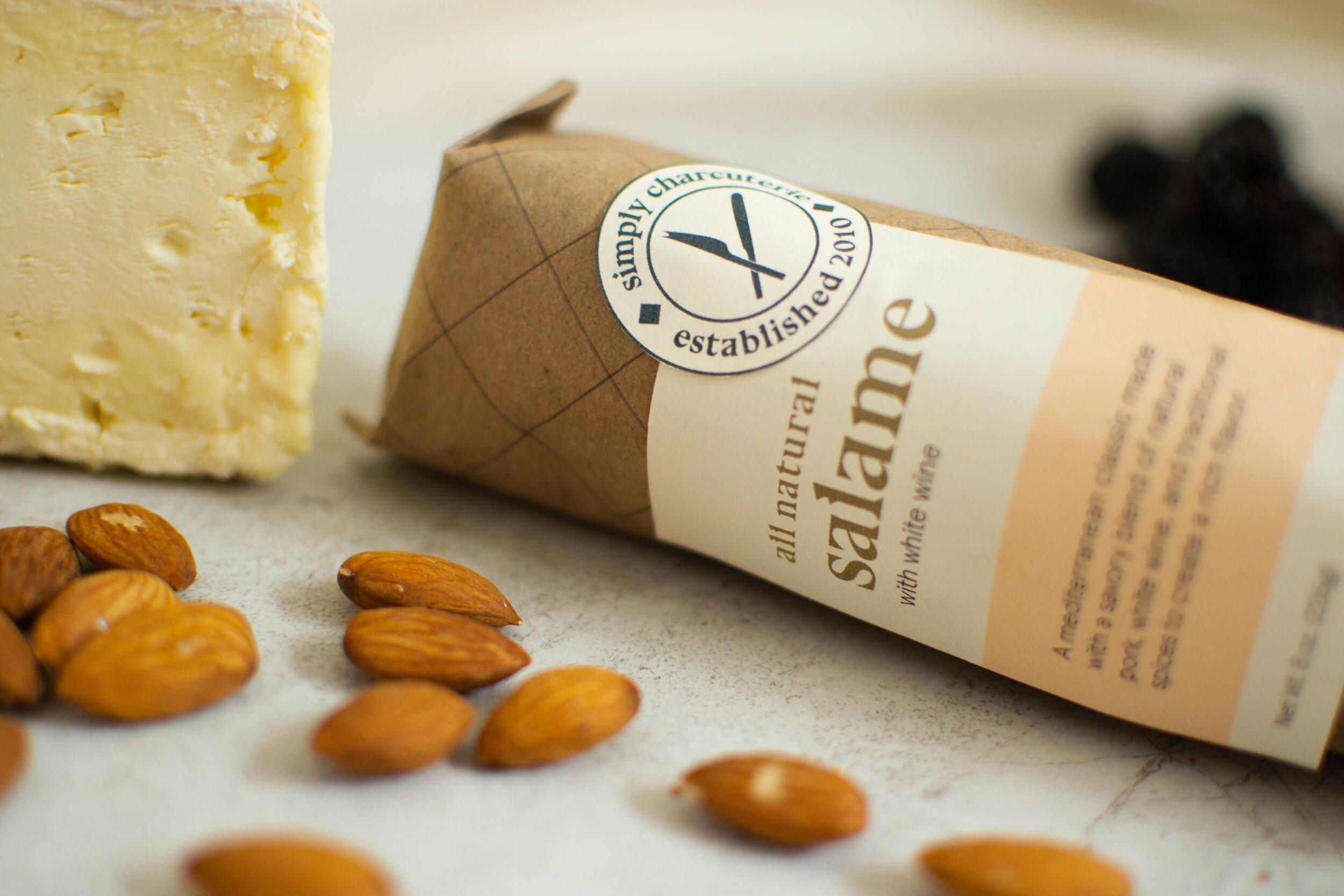
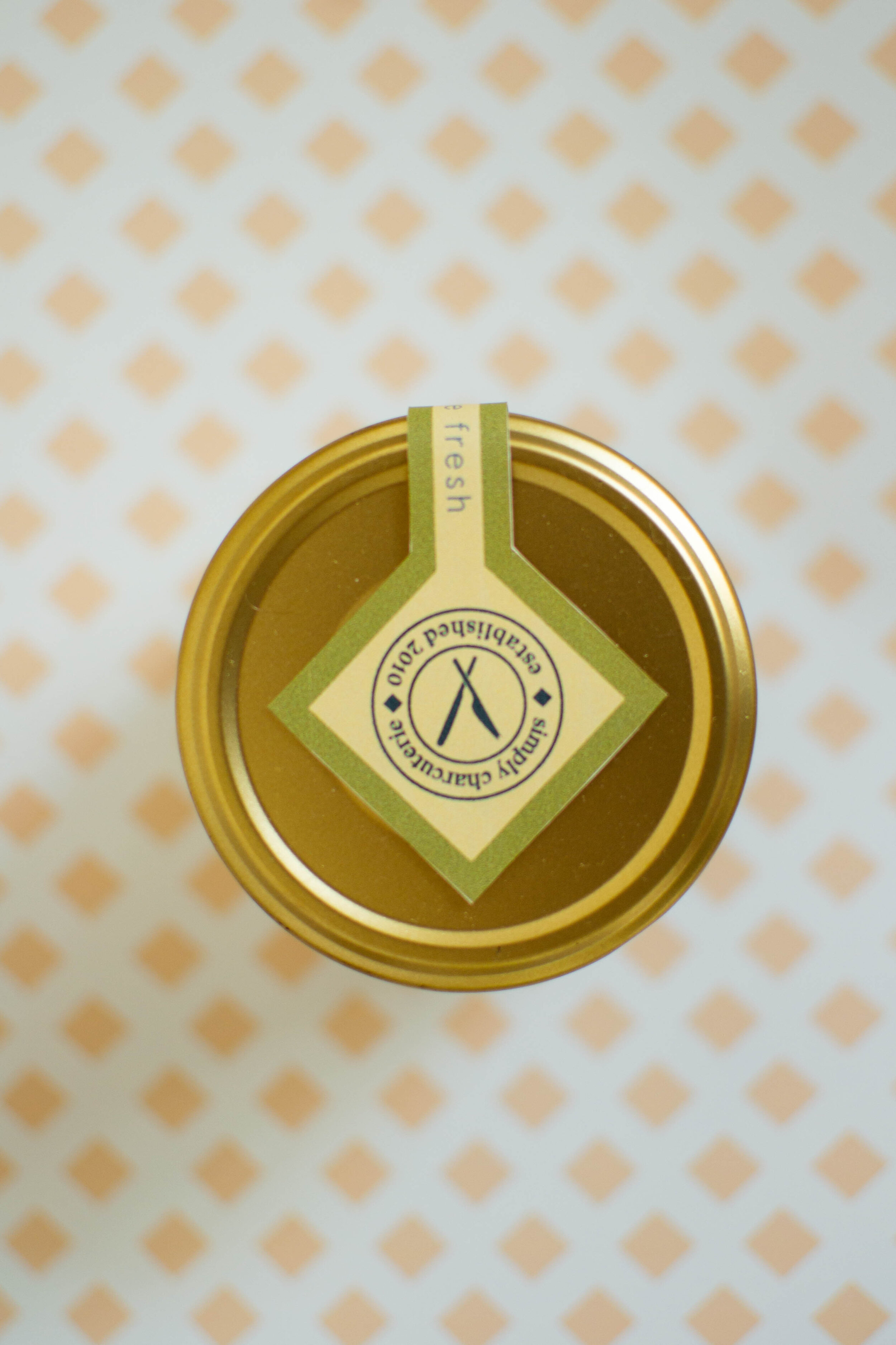
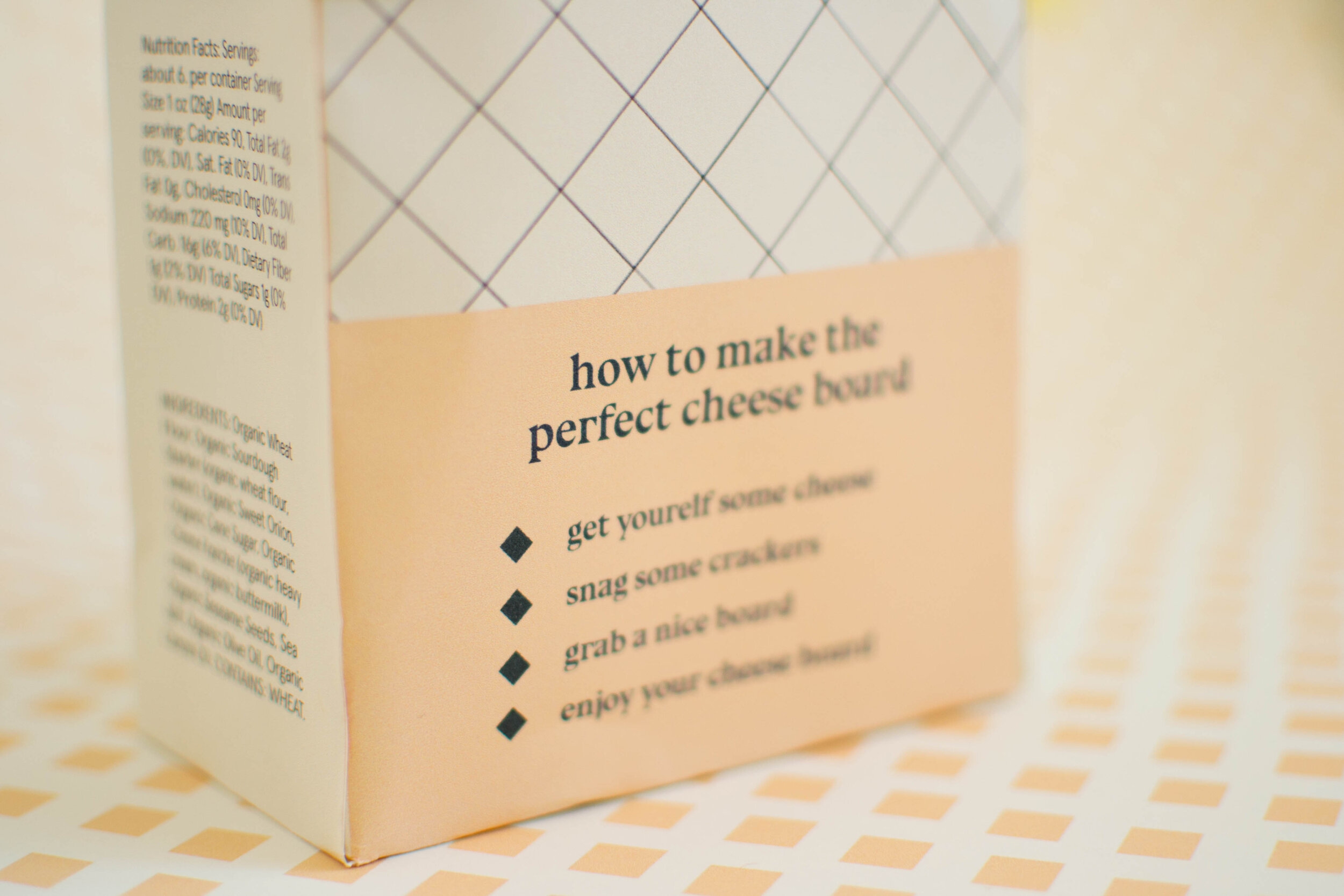
The Solution.
Simply Charcuterie takes the snootiness out of luxury snacking. Using pattern and color to differentiate products and keep each one unique, this branding and packaging style is one of a kind. I drew from the display typeface Bluu Next by Velvetyne Type Foundry to create the patterns. By using similar assets, the products feel related without being exactly the same. A traditional logo mark is used as needed to nod to the more conventional and rustic nature of charcuterie boards. This project gave new life and a modern twist to a classic food experience.