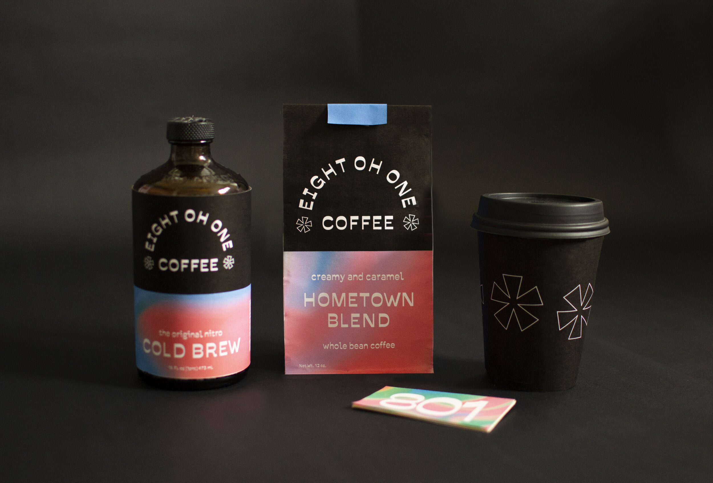
801 Coffee
Category: Branding & Packaging
Completed: Spring 2020
The Goal.
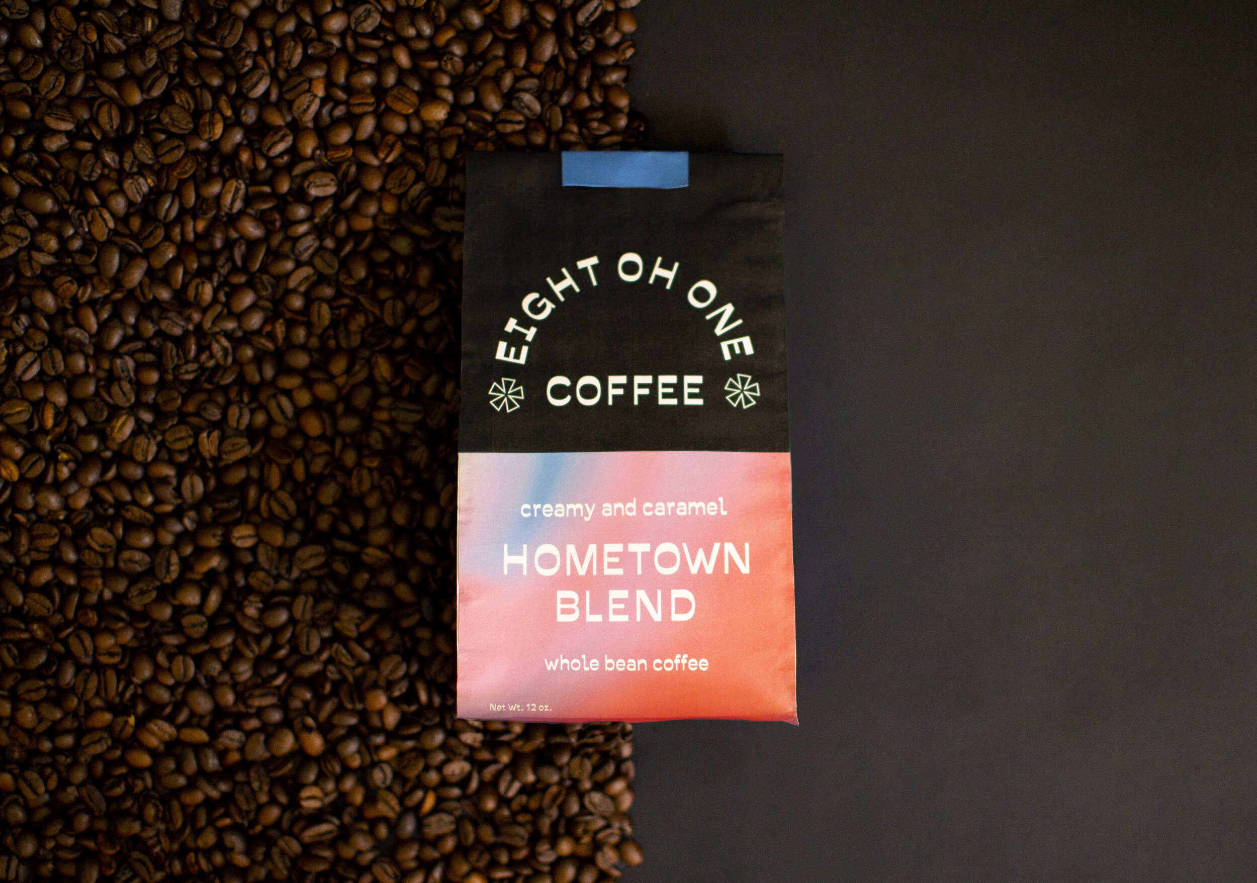
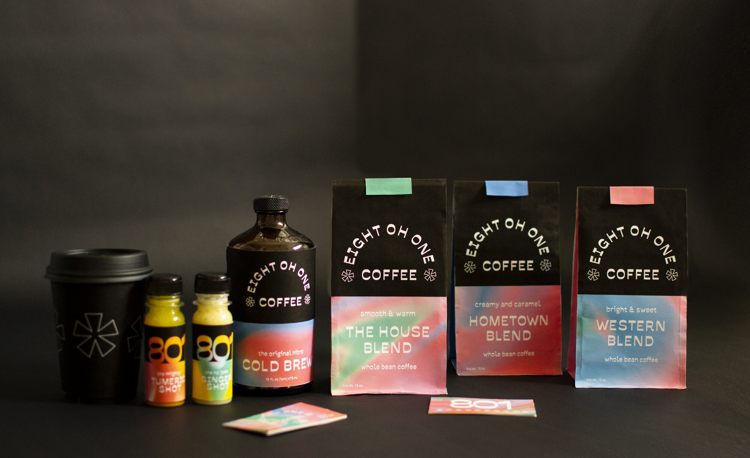
When I designed a brand identity and packaging for 801 Coffee I was tasked to create something that reflects these words: young, urban, hip socialite, bold. During my research I found that coffee packaging was often extremely overloaded with information, a lot of text, and distracting imagery.
The Solution.
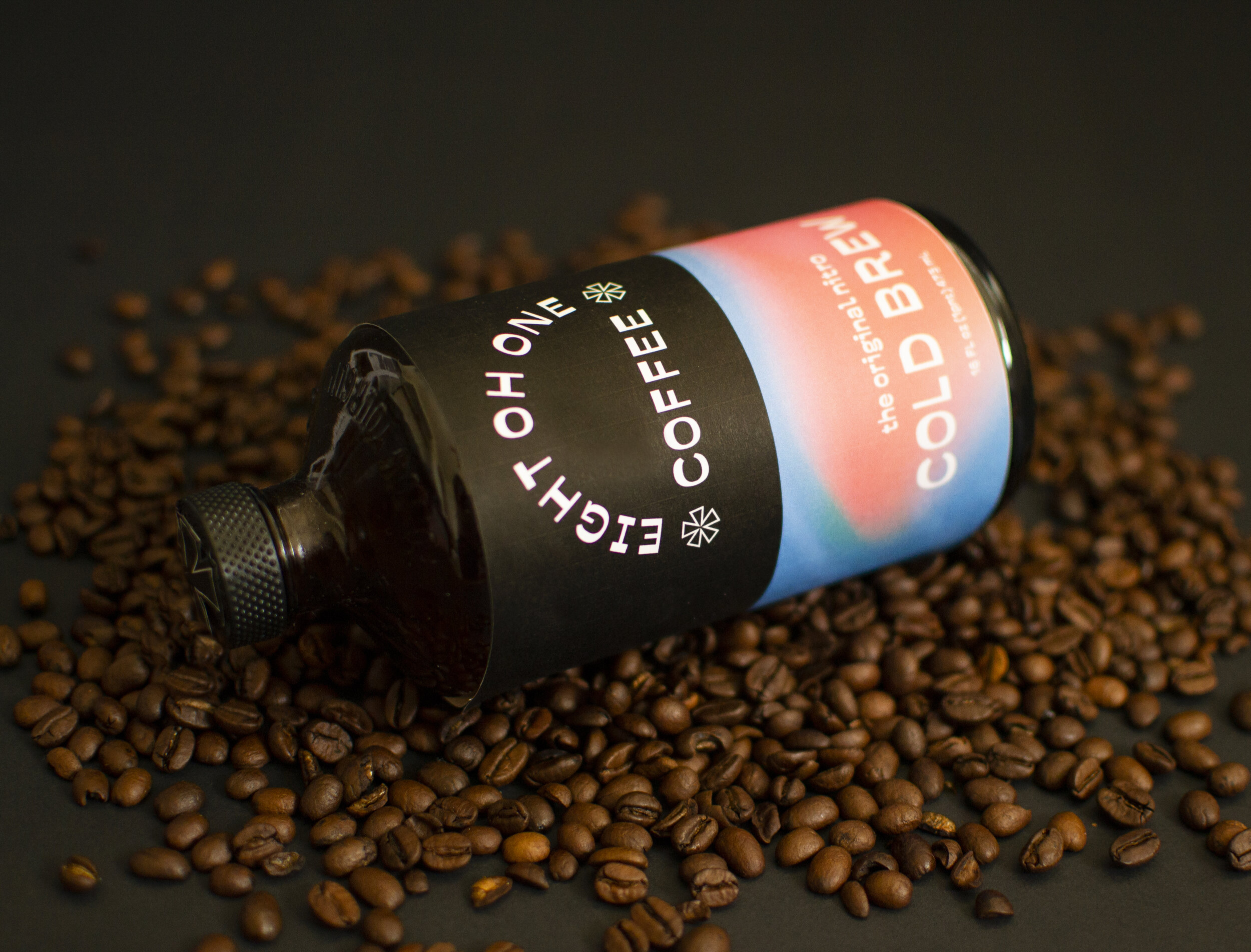
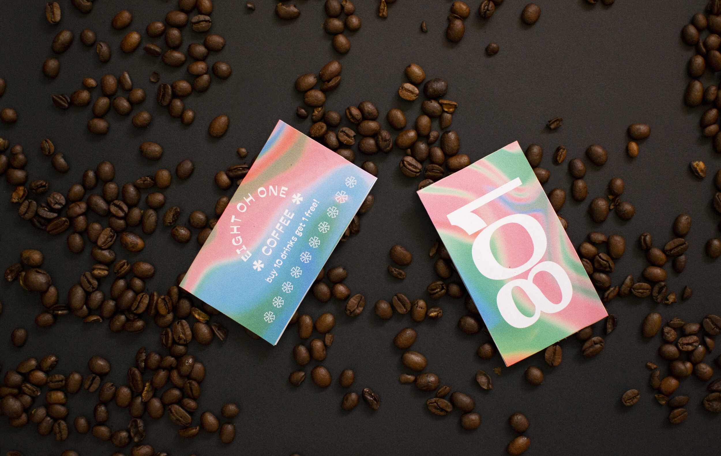
In response to the overwhelming amount of information normally found on coffee packaging, I created a system that relied more on color and display type to relay relevant details. In particular, every colorway is unique to each blend of coffee. They are striking and bold but not overbearing. Using "801" and "eight oh one" interchangeably was my unique way of making the logo expandable while not being repetitive.
